Drum head normal modes, with movies
We’re working our way through Boas in my Mathematical Physics class, and we’ve come to the point in the PDE chapter where every good Physics student figures out what the normal modes of a circular drum head ought to look like. Punchline:
Drum heads
So, we get to the intuitive answer that we’re looking for $$J_n(k_{mn}r)\cos(n\theta)\cos(kvt)$$, where $$k_{mn}$$ is the $$m^{th}$$ zero of $$J_m$$ (we could also look for the $$\sin \sin$$, $$\sin \cos$$ or $$\cos \sin$$ solutions, but they’re not fundamentally different), and Boas has the standard picture of the nodelines to help with visualization. I’m becoming increasingly convinced that students should be competent with at least a little bit of Python. You could argue for Matlab or Mathematica, but I’m leaning heavily towards Python for a number of reasons[*]. The point is that things like “the sum of two specific traveling waves is a standing wave” are just easier to see if you can visualize and animate things, and they pack a bigger punch if you can do that yourself.
matplotlib animation interlude
I used standard matplotlib animations to show some basics with traveling waves, standing waves, Bessel functions, and building up series solutions piece by piece. The animation framework is excellent, because it’s simple to use and a traveling wave looks like this:
#!/usr/bin/env python
from __future__ import division
from numpy import sin, pi, linspace
import matplotlib.pyplot as plt
from matplotlib import animation

# First set up the figure, the axis, and the plot element we want to animate
v = -0.01
fig = plt.figure()
ax = plt.axes(xlim=(-4, 4), ylim=(-2, 2))
line, = ax.plot([], [], lw=2, color=’red’)

# initialization function: plot the background of each frame
def init():
    line.set_data([], [])
    return line,

# animation function.  This is called sequentially
x = linspace(-4, 4, 2000)

def animate(t):
    y = sin(2 * pi * (x – v * t))
    line.set_data(x, y)
    return line,

# call the animator.  blit=True means only re-draw the parts that have changed.
anim = animation.FuncAnimation(fig, animate, init_func=init,
                               frames=100, interval=20, blit=True)

plt.show()
I can talk the students through it, and there are really only two interesting lines: the v=-0.01 to set the velocity and the y = sin(2 * pi * (x – v * t)) to do the math. Students can change the sign of the velocity to see it move in the other direction, change the math line to have some series solution, etc. in a straightforward way. We did that with our solutions for plucked and hammered strings (guitar vs. piano). It made for a nice in-class demo, and I’l have the students more involved from the start of the semester next time. There’s code for simple waves in my github repo, and you can find lots of decent animations on the net.
back to drum heads
What you can’t seem to find (or, at least, I can’t Edit: I knew the web had to have a nice demo, and here’s one using Mathematica) is animated versions of the normal modes we want ($$J_n(k_{mn}r)\cos(n\theta)\cos(kvt)$$). The math part is easy, especially because scipy.special has such nice things built in. The main part just involves
from scipy.special import jn, jn_zeros
from numpy import cos

def k(m,n):
    return jn_zeros(n,m)[m-1] # m is 0-indexed here

result = jn(n,k(m,n)*R)*cos(n*theta)*cos(k(m,n)*v*t)
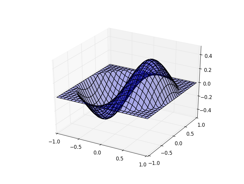
The animation part is a bit trickier because I really want 3D plots in addition to the 2D ones, and the matplotlib 3d canvas doesn’t play nicely with the animation framework. It’s still not particularly tricky. When we plot something, we get an object back. We usually ignore that object. In order to “animate” things, we just keep track of that object and delete it each time through our main loop. I ended up with two versions of the code. The one below has a couple of nice features. It animates a single mode, but you can specify that on the command line. Optionally, you can also specify “cc” for “cos cos”, “cs” for “cos sin” etc.
The funny business with zlim near the end is because matplotlib sets the z limits of the plots automatically, each time you plot something. In our case, it looks much smoother to just start the z axis at (-1,1) instead of watching it stretch throughout the first oscillation.
#!/usr/bin/env python
from __future__ import division
“”"
Based on the wireframe example script
“”"
from mpl_toolkits.mplot3d import axes3d
import matplotlib.pyplot as plt
from matplotlib import cm
from numpy import sin, cos, arctan, arctan2, array, sqrt, linspace, meshgrid
import scipy
import scipy.special
from scipy.special import jn, jn_zeros
import time, sys, os

v = 1
n, m = 1, 1
if len(sys.argv) >= 3:
    n,m = [int(i) for i in sys.argv[1:3]]
if m == 0:
    sys.exit(“M must be greater than or equal to 1″)

if len(sys.argv) >= 4:
    fns = sys.argv[3]
else:
    fns = ‘cc’

f1 = {‘s’:sin,’c':cos}[fns[0]]
f2 = {‘s’:sin,’c':cos}[fns[1]]

def k(m,n):
    return jn_zeros(n,m)[m-1] # m is 0-indexed here

def generate(X, Y, t):
    theta = arctan2(Y,X) # This does arctan(Y/X) but gets the sign right.
    R = sqrt(X**2 + Y**2)
    # We know z = J_n(k*r)*cos(n*theta)*cos(k*v*t)
    #
    result = jn(n,k(m,n)*R)*f1(n*theta)*f2(k(m,n)*v*t)
    result[R>1] = 0 # we plot points from the square, but physically require this.
    return result

plt.ion()
fig = plt.figure()
ax = fig.add_subplot(111, projection=’3d’)

xs = linspace(-1, 1, 100)
ys = linspace(-1, 1, 100)
X, Y = meshgrid(xs, ys)
Z = generate(X, Y, 0.0)

wframe = None
tstart = time.time()
for t in linspace(0, 10, 400):
    oldcol = wframe
    Z = generate(X, Y, t)
    #wframe = ax.plot_wireframe(X, Y, Z, rstride=2, cstride=2)
    wframe = ax.plot_surface(X, Y, Z, rstride=4, cstride=4, alpha=0.3)

    # Remove old line collection before drawing
    if oldcol is not None:
        ax.collections.remove(oldcol)
    if n == 0:
        ax.set_zlim(-1,1)
    else:
        ax.set_zlim(-0.5,0.5)
    plt.draw()
The individual frames look something like
I also made a beefier version (you can find it in my github repo) that plots several of the modes in a grid. The different columns are m=1,2,3 and rows are n=1,2. The script lets you plot as many or as few of these as you’d like. It shows a 2D version next to the 3D version, and the nodelines are shown in black on the 2D version.
I also followed The Glowing Python’s idea of writing out a bunch of png files for each frame and making a movie with ffmpeg:
ffmpeg -q:a 5 -r 5 -b:v 19200 -i img%04d.png movie.mp4
Here’s the movie:
and you can download a slightly higher quality version here. You can download a slightly higher quality of the movie at the top of this page (2 values each of m and n) here.
[*] Among other things:
- Python is free, which is important at a small school
- I want this to show up in a computational modeling class, and I want that class to draw in CS, biology, chemistry, biochemistry, math, econ and geology students. I think Python is an easier cross-department sell
- The IPython Notebook is fantastic these days
Comments
Comments powered by Disqus